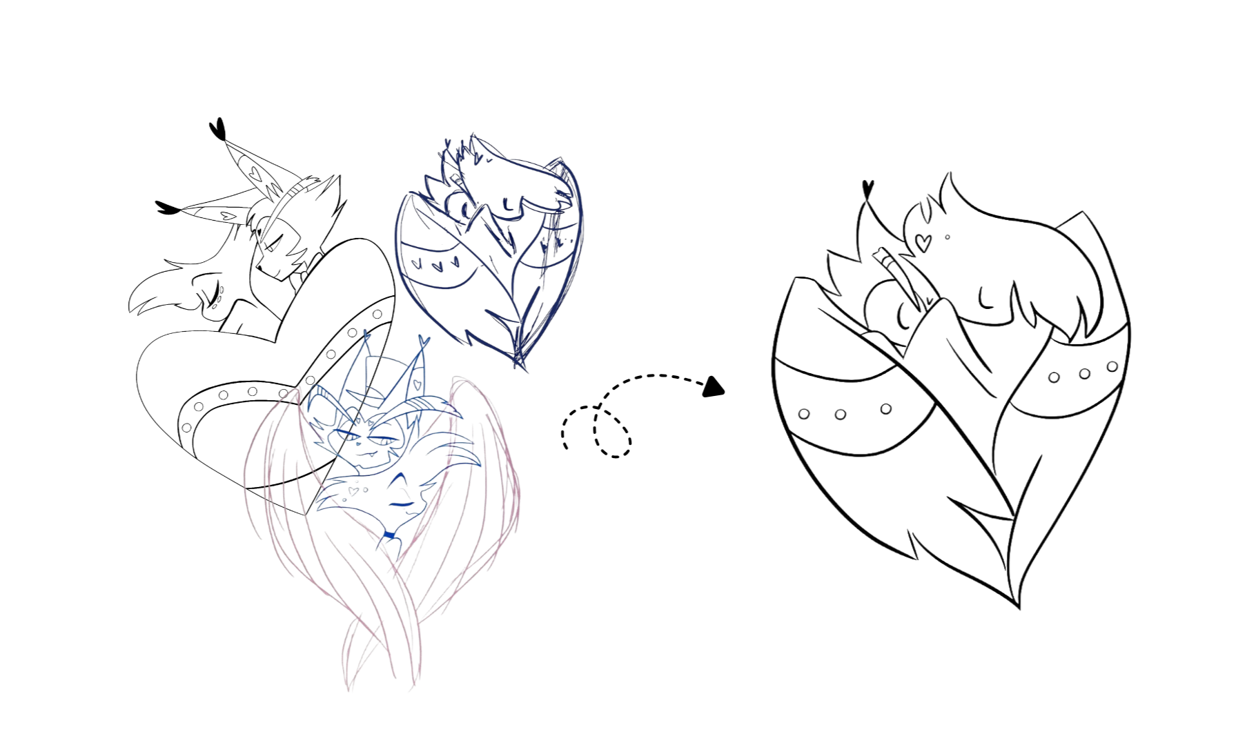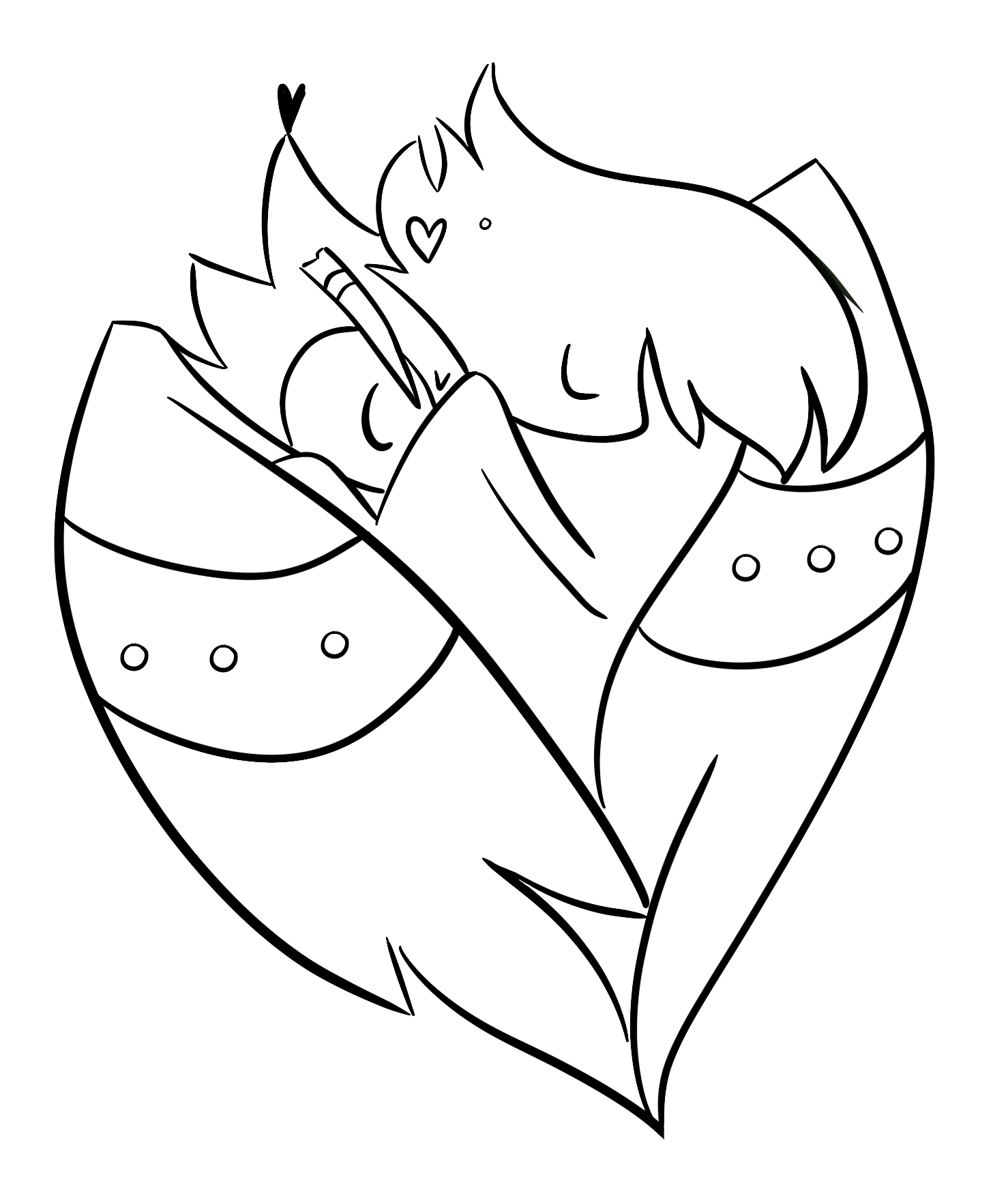
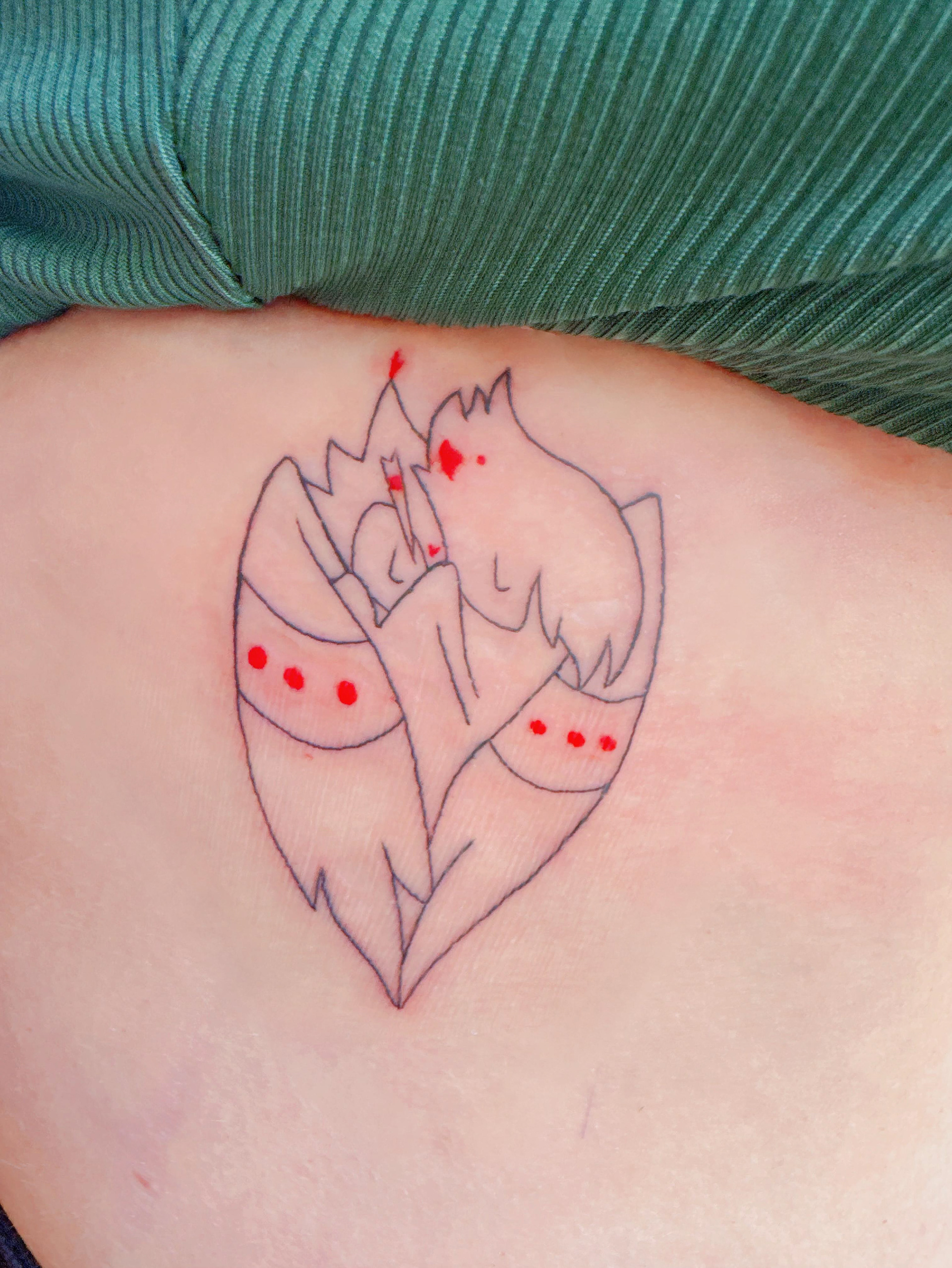
On the left are the initial concepts. In my very first design, the heart stands out, but the character's wings are barely noticeable, which defeated the goal of creating a heart out of the wings. To fix this, the concept shifted to using both wings.
While the tattoo artist provided a gorgeous initial illustration, it was simply too detailed for the small, minimal placement we wanted. To resolve this, I created a highly simplified custom graphic line illustration for the artist to execute. The result is almost icon-like: clean and compact, yet instantly recognizable to fans of the series. Translating that complex idea into such a subtle design was a great achievement for me.
While the tattoo artist provided a gorgeous initial illustration, it was simply too detailed for the small, minimal placement we wanted. To resolve this, I created a highly simplified custom graphic line illustration for the artist to execute. The result is almost icon-like: clean and compact, yet instantly recognizable to fans of the series. Translating that complex idea into such a subtle design was a great achievement for me.